How to Create a Whole Home Color Scheme
Ready for help choosing colors for your home? I'll show you exactly how to create a whole home color scheme to effectively pick paint colors in this post.
Part two of the home color section of pursuing a homier home is all about how to create a whole home color scheme to guide you in choosing paint colors for your home.
In case you missed part one, here are each of the parts of the color bonanza in laying the foundation of a homier home:
- Part 1: Everything You Must Know About Color in your Home [Before Choosing Paint Colors]
- Part 2: How to Create a Whole Home Color Scheme
- Part 3: 8 Secrets to Choosing Home Paint Colors [From Around the Web]
**Don't forget you can catch up with the entire pursing a homier home series starting with Phase 1, Step 1 here.**
Let's get started!
Table of contents
Disclaimer: This site does include affiliate links for your convenience. This is at NO additional cost to you but earns me a small commission to help keep my blog up and running. To read more, check out our disclosure policy.
Why You Need to Create a Whole Home Color Scheme
In part one of this color series, we talked about the basics of color theory to help you decide on a harmonious color palette for your home.
This post is all about actually taking that knowledge and creating your home color palette.
You may be asking yourself why you should care? Why not go with the colors you like and let the rest fall in place?
The biggest reason for not flying by the seat of your pants when it comes to color is the lack of focus when you shop and the greater chance of choosing a wrong paint color or color combination for your home.
Giving yourself a general map of color will help you choose the right colors the first time. To save you time and energy, thinking about your color scheme ahead of time is the way to go.
Where to Start
Answering the following will help guide you in beginning your whole home color scheme and help you gather your thoughts on your own color preferences and style.
- What colors make you happy?
- What colors do you love to wear?
- What colors are you drawn to when looking at other people’s homes in person or in magazines?
- Do these colors fit the feels you want for your home?
- Which color combination palette do you feel most describes the feelings you want to evoke in your home? (i.e. monochromatic, complementary, analogous, split complementary: see descriptions in part one)
For me, I am drawn to blues, greens, pinks, and neutrals. My go to color to wear is navy.
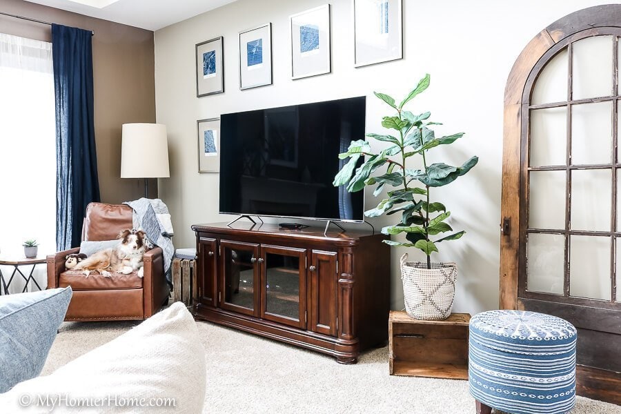
Being a pale, freckled, blue-eyed Irish girl, navy is less harsh than black and softens my look.
When I'm in others homes, I love bright, airy spaces that are majority neutral with pops of color and interesting patterns.
The feels I want in my home are cozy, inviting, stress-free vibes. I want people to feel like they can relax and enjoy each other's company.
The color combination I lean towards is the analogous color palette with my bold color being navy and the accent colors leaning towards green and light tints of purple or pink.
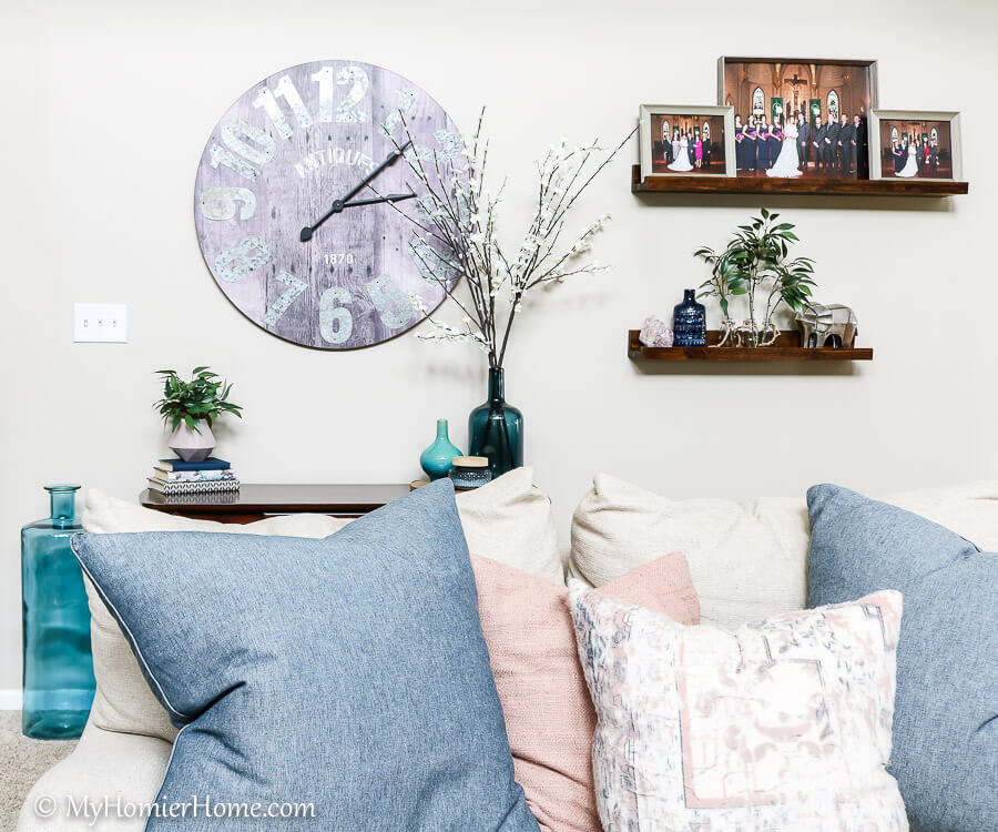
Steps to Creating a Color Analysis map
A color analysis map makes this sound really formal and complicated, but it is actually very simple.
The idea is to walk your home and get an idea of what colors already exist on items you don't plan to change, such as floors, cabinets, countertops, etc.
If you plan to change any of these permanent fixtures in the near future (less than a year), I would suggest leaving that permanent fixture out of your analysis and/or making a note of its change on your sheet.
1. Sketch a Floor Plan
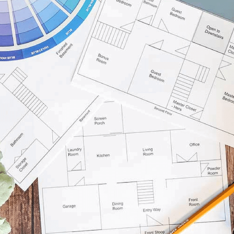
On the guiding worksheet, there is room to draw out a sketch of your home.
No need to be too precise with the measurements, but you want to have a visual of how your rooms flow together.
Start with your first floor and repeat again with any other levels of your home that you would like. I have found that the first floor helps give you the most clarity.
2. List Permanent Fixtures
Below your sketch, you will want to list anything permanent in the room that you will not be changing in the near future.
You want to consider the following, but not limited to:
- Floors
- Paint
- Furniture
- Tile
- Countertops
- Cabinetry
It is important you write down everything you will be keeping in this room because the rest of your color decisions will be based on this.
3. Identify Undertones
Identifying undertones can be tricky, but it just takes a little coaching on knowing what to look for.
Undertone colors usually fall within blue, green, purple, red, pink, yellow, orange, gray, or brown.
Typically, if the mass tone (main color you see) is a warm color (red, orange, yellow), the undertone will have a warmer undertone and vice versa for cool colors.
To determine an undertone, you want to make sure to look at the permanent fixture next to a pure color.
For instance, if you are trying to decide what undertone your white paint has, place something pure white next to it, such as a white piece of paper.
If you suspect your flooring has a red mass tone, put a pure red color item next to it and the undertone will pop. If you don't have any pure colors, use a color wheel.
If you know for sure you are going to change the permanent piece soon, highlight it and make a note later of what undertone would go best with your other undertones in the room.
When using this to pick new paint colors, it will be best to look at the full paint color strip.
The mid-range to dark colors on the strip will give you more of the reveal of the undertone.
For paint, if you access to a full paint fan deck, looking at the paint options fanned out will also help you pick out the undertone.
4. Pick your Colors
Once you've identified the undertones that go along with your permanent fixtures, you will want to reference the color combinations section in part one: home color basics to pick out the vibe you want to achieve (monochromatic, complementary, split complementary, or analogous).
Getting clear on the type of vibe you want will help you choose your colors and make sure they go with your permanent items.
Main Color
Choosing a main color may be the easiest part because of the questions you answered in the beginning.
Now that you know what undertones you are working with and what type of color combinations you want from the color theory discussion, you will want to take all of this into consideration.
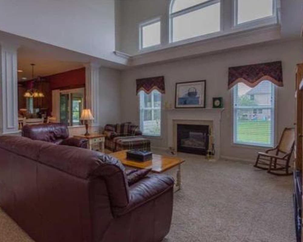
Living Room Before…
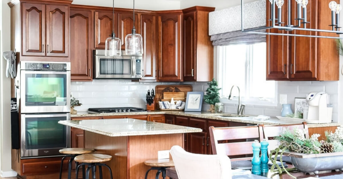
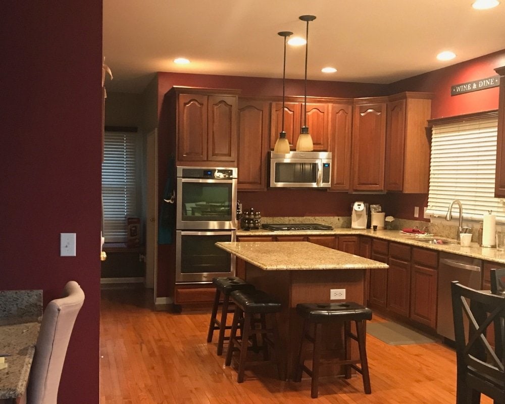
Kitchen Before…
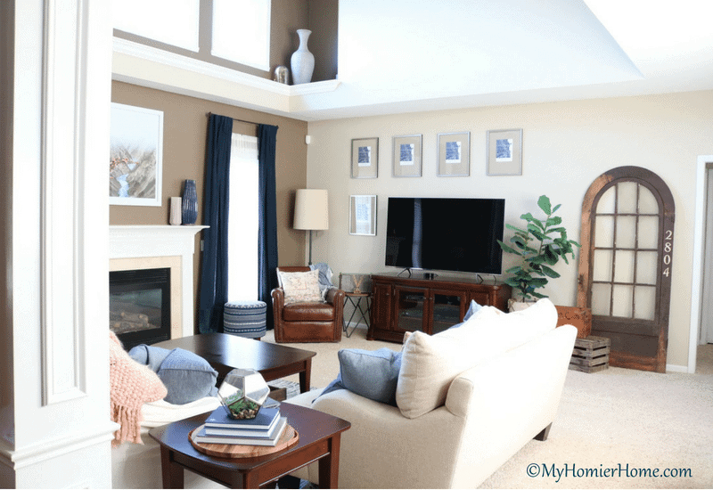
Living Room After…
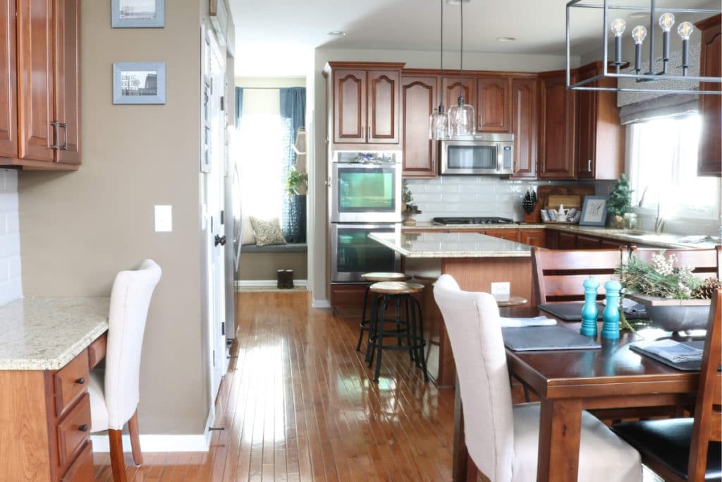
Kitchen After…
In my house, the 90s heavy red, orange, yellow vibe was strong when we bought it.
I'm not a huge fan of a warm dominating color palette, but we were also not looking to change the flooring, cabinets, or countertops.
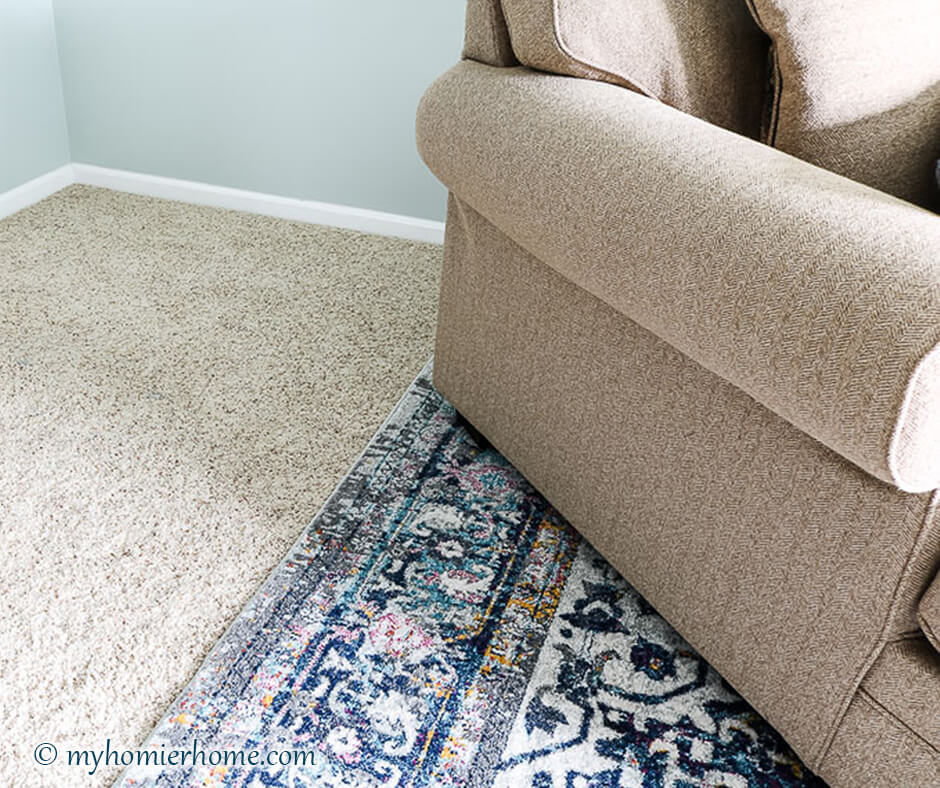
Our original white paint had a distinct pink undertone while our cabinets had a red undertone, countertops had a brown undertone, and our floors had an orange undertone – a lot going on here.
Paint was definitely something we were willing to change, but I had to take into account the cabinets, countertops, and floors for sure.
Our carpeting was fairly neutral, so even though we weren't planning to change the carpeting either, it didn't play as large of a role in my further color choices.
My main color is navy, but I chose an analogous pattern to begin with for my decor.
Since I was working with orange and red undertones in my kitchen, a lighter tint of navy pushed me a bit into the complementary side of life for my kitchen.
My analogous color combinations (green, blue) are still a part of my overall decor, but for my kitchen (and any other room with our hardwoods), I kept things more muted and avoided the purple in any form in the kitchen.
Neutral Color
You will want to pick a neutral go-to color as well from either a cool gray, warm gray, greige, white, black, or beige. Most of us will choose a white paint color for our whole house and another neutral to repeat on the walls.
This will be dependent on how you want to balance your undertones.
If you have a ton of warm undertones (like me), but want to choose more of a cooler color palette, you will want to find a greige paint color.
My greige is Benjamin Moore Grant Beige, which has a gray undertone and chameleon behavior.
In certain lights you can see the gray base, but it never shows up too cold.
A great way to create harmony in a room is to keep the warm and cool tones balanced, so consider this when determining what type of neutrals you want.
Accent Colors
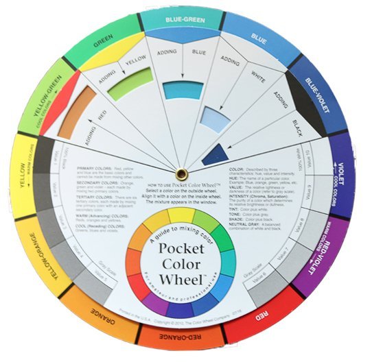
When it comes to accent colors, I would recommend staying in the color combinations palette you chose (monochromatic, complementary, split complementary, or analogous).
If you are using a color wheel, you can put your main color at the top and match the colors accordingly.
Since I prefer an analogous color palette, I have blue or navy in the center and then greens and some purples intermixed.
I don't use purple often, but it is an accent in our master bedroom.
Purple can be a touch overwhelming sometimes, so I like to keep it subdued and in a room in which the door can be shut.
When I'm just dealing with a room in different tones and tints of navy, I bring in some light pink or blush to liven it up a bit.
It's important to remember all this color talk gives you a guide on a place to start. If you've made color for either decor or wall colors in the past, this exercise is a great way to get it right the first time.
My Whole Home Color Scheme

- Main Color: Navy (avoid purple undertone)
- Neutral: Greige
- White: Slightly warm undertoneAccent Neutral 1: Grayish Brown
- Accent Color 2: Light Blue
- Accent Color 3: Muted Green
- Accent Color 4: Blush
- Accent Color 5: Medium Blue
In the guided worksheet, you will find a printable to walk you through these decisions and help you get your color map visual in order.
Once you have the general idea of what you are looking for, your trip to the paint store will be much more focused because you will be able to look at a more narrow array of colors that fit the undertone and main color that you need.
However, even though you have a clearer understanding of what kind of colors to focus on, don't miss the next post in the series, Part 3: The Secrets to Choosing Home Colors & Paint Colors, where I give you a round up of the best tips for choosing paint colors from all my favorite bloggers and paint experts.
This includes how to take into account lighting, light reflected values and how to hone in on your specific color with the giant array of paint chips.
Don't forget to leave a comment with questions or wins in choosing your home color scheme!


