Everything You Must Know About Color in your Home
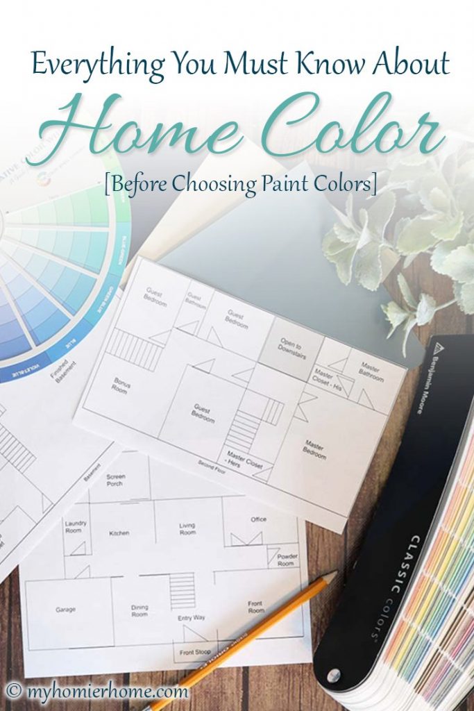
Everything you need to know about color before choosing paint colors for your home is right here! Creating a home color scheme is your first step!
Welcome back to the Pursuing a Homier Home Series! In case you're new to the series or just need a refresher, here are the steps we've taken so far in this pursuit:
- 6 Questions to Help You Define Your Homier Home
- 8 Reasons I Decorate My Home + How to Find Your Why
- How to Identify your Home's Feels & Functions
Since we have laid nearly all the foundational steps to a cohesive home, it is time to talk about color!
Because there is so much to be said when it comes to color, I have split this post into three parts:
- Part 1: Everything You Must Know About Color in your Home [Before Choosing Paint Colors]
- Part 2: How to Create a Whole Home Color Scheme
- Part 3: 8 Secrets to Choosing Home Paint Colors [From Around the Web]
Each of the action steps surrounding these color basics will give you the clarity you need to create a cohesive home. I have done a ton of research on the color subject and have compiled all this great information into a simple, easy to follow post you can refer back to again and again. Don't forget to leave a comment at the end of the post and let me know what you think! On to the color bonanza part one…
Table of contents
Disclaimer: This post does include affiliate links for your convenience. This is at NO additional cost to you but earns me a small commission. To read more, check out our disclosure policy. As an
Basic Color Vocabulary
When it comes to interiors and color, understanding the science & psychology behind color can really help clear up some of the overwhelming nature of the color discussion.
Before we get into it, here are some vocabulary words you will need to know.
- Hue: Fancy for the ‘name of the color'
- Tint: Any color + white added to it
- Tone: Any color + gray added to it
- Shade: Any color + black added to it
- Value: On a scale of 1 to 10, the lightness (10) or darkness (1) of a color
- Cool Colors: Receding Colors (Greens, Blues, & Violets)
- Warm Colors: Advancing Colors (Reds, Oranges, & Yellows)
This list of vocabulary words is not nearly comprehensive, but it will give us a good starting point.
Some of the other vocab will be discussed in the next section.
Overview of Color Theory
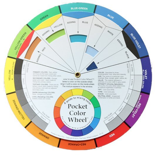
Many of us are fully aware that a color wheel exists, but perhaps you've never used one.
Dialing it back to elementary school, let's talk about the 12 different colors you see on the color wheel above.
COLORS ON THE COLOR WHEEL
Primary Colors
As you know, red, yellow, and blue are your primary colors.
These can be found evenly spaced from each other on the color wheel.
They are the real OG's of the color world because they can't be made from any other color… they are the original gangsters of color.
Secondary Colors
The next level leadership of colors are orange, green, and purple.
These are created by combining two primary colors together.
They can hold their own when the boss is a way on business, but they were highly influenced by the OG's above. (I may be watching too much of The Wire on HBO lol)
Tertiary Colors
These you may not be as familiar with as far as their name, but tertiary colors are the wanna-be's of the color wheel.
They are created by combining one primary color and one secondary color: blue-green, blue-violet, yellow-orange, yellow-green, red-violet, & red-orange.
TYPES OF COLOR COMBINATIONS
I will walk you through tips on how to choose your main color in part 2 of this color discussion, but for now I want to give you the basics of combining colors to create harmony in your home.
When we start to breakdown the colors on the color wheel, you can see that they have a wonderful cohesiveness about them as your eye follows the colors around.
When choosing colors for your home, the color wheel and a little bit of color theory can really help you narrow down the choices.
Monochromatic
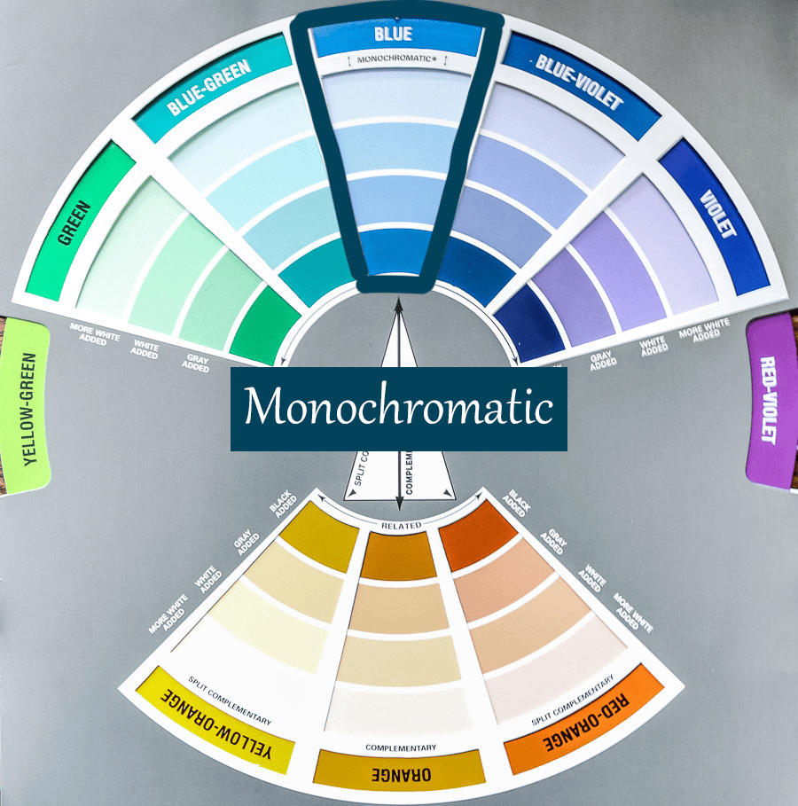
Monochromatic color combinations pick one bold color and then choose different tints, tones, and shaded of that color throughout their home.
On the color wheel, you can see the different tints, tones, and shades underneath each hue.
Some may choose to create a monochromatic palette using a neutral color as well (white, gray, beige, black).
The key to not creating a boring space with many neutrals or all one color is to make sure you add in textures and patterns to keep the visual interest.
Complementary
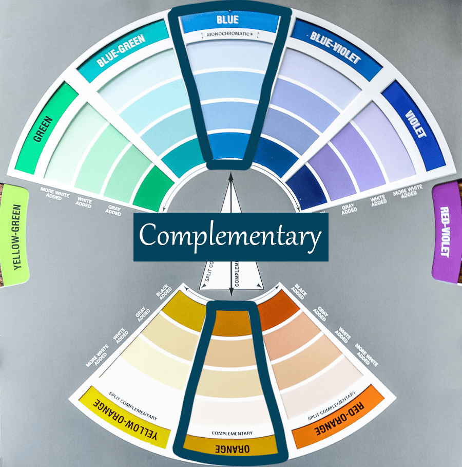
Complementary color combinations choose two colors directly opposite each other on the color wheel.
Complementary color combinations tend to be more energetic, vibrant, and lively because you are combining one warm color with one cool color.
This color combination really makes the two colors pop.
If you are trying to bring some energy to your home or room, using complementary colors as accent colors in a majority neutral palette may be your best bet to not overwhelm your home or room with too much contrast.
This is definitely a bold color palette, but if that is what you are after, this one is calling your name!
Split Complementary
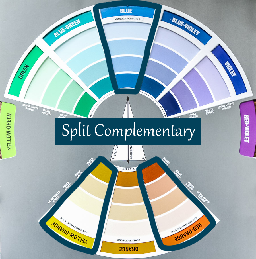
Split complementary color combinations choose a main color and then two colors on either side of the complement (color opposite on the color wheel).
If you like the idea of the complementary color scheme, but you are a little scared of the boldness of it, split complementary will work better for you.
It is more of the tame or calm version of the complementary palette.
I've read many articles that suggest using a more muted main color in this palette and then balancing it out with the other two split complementary colors.
Analogous
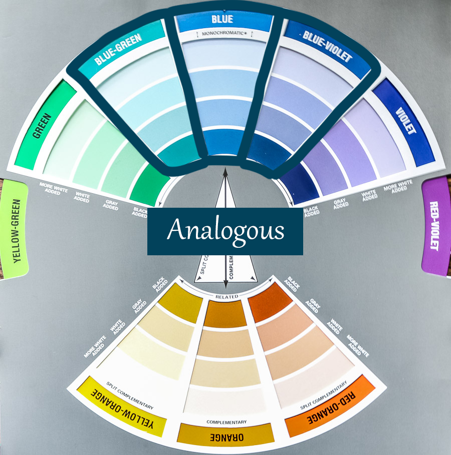
Analogous color combinations choose three (or four or five) colors next to each other on the color wheel and utilize the 60-30-10 rule to help balance these colors in your space.
When choosing an analogous combination, it is usually best to use the least bold color as your main color and the most bold color as your accent color.
You can also use a neutral as a supporting color to your dominant color.
My style fits the analogous combination if you look at my overall home, but I do like to use a monochromatic palette in certain rooms with maybe just a muted hint of another analogous color.
So remember, these color combinations are just to get you started through your color journey, but rules are meant to be broken.
Don't feel like you have to be trapped into one of these labels.
However, these are rooted in science and have the most likelihood of guiding you to a harmonious color palette, so try to follow the ideas in general as you choose colors for your home.
With all the different shades, tones, and tints of colors, I'm certain you will not feel pigeon-holed if you follow one of these palettes. 😉
Overview of the Psychology of Color
Understanding how color theory works and what is pleasing to the eye is super important when creating a cohesive home.
But of course, that's not the end of this color discussion.
I don't know about you, but psychology is one of my favorite topics.
I majored in mathematics in college, but loved psychology so much I inadvertently achieved a minor in it as well!
I'm obsessed with understanding how the mind works, so it's no mystery that the topic of the psychology of color makes me giddy.
There are so many great resources on this topic, but the gist for us today is answering the question, “How does color affect our mood?”
In my post on identifying the feels and functions of your home room by room, I talked about how the feeling of a room is just as important as how it functions.
So, part of our color talk today has to talk about the feels, right?
I will give you a quick overview and then attach some references for further reading if you are interested.
Cool Colors
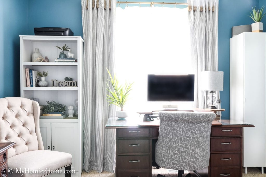
To remind you from earlier, cool colors are the blues, greens, and purples category.
Cool colors can evoke a range of emotions from calmness to sadness.
The trick with cool colors is to not live only on the cool side of the color wheel in its entirety because you run the risk of creating a space that actually feels cold and lifeless.
Balance is always key.
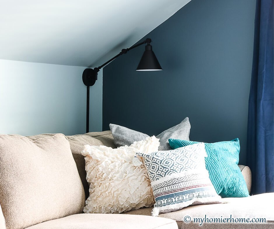
You can see in my newly renovated office that the carpet and drape tassels with the warm wood tones bring a balance to the cooler blue walls.
However, cool colors can provide a calming space because they are receding colors and tend to allow your eyes to rest.
Blue is actually quite calming and has been said to reduce blood pressure.
It's not a color you want in your kitchen, but would be great in a bedroom.
Green creates harmony because of its tie to nature and causes less strain on the eyes.
Purple is great for a home office because it is a balance between blue (calming) and red (stimulating).
Also, purple was a tough color to create back in the day, so usually only the wealthy wore it making purple give off the feeling of royalty and sophistication.
Warm Colors
The other half of the color wheel is made up of the warm colors, red, orange, and yellow.
Warm colors made a big impact on the 90s decor scene while cool colors seem to be all the rage these days.
If you are not a fan of the warm color side like me, keep in mind all spaces need to have a little bit of both sides to create balance and evoke the feelings you want the room to have, too.
You don't have to paint a whole room red (**cough, cough** previous owners), to warm up a room.
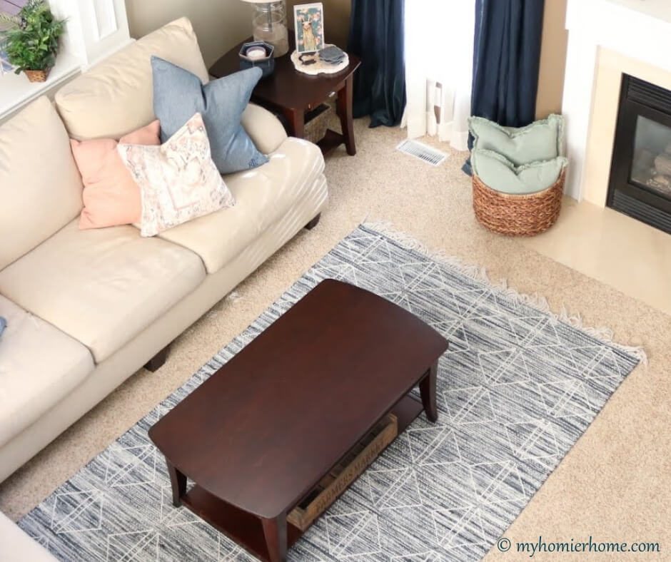
It can definitely be more subtle than that, such as the hint of pink in my living room and the warmer tone in the wall color and wood.
Since my home was built in the late 90s, we have a lot of warm, red tones floating around throughout.
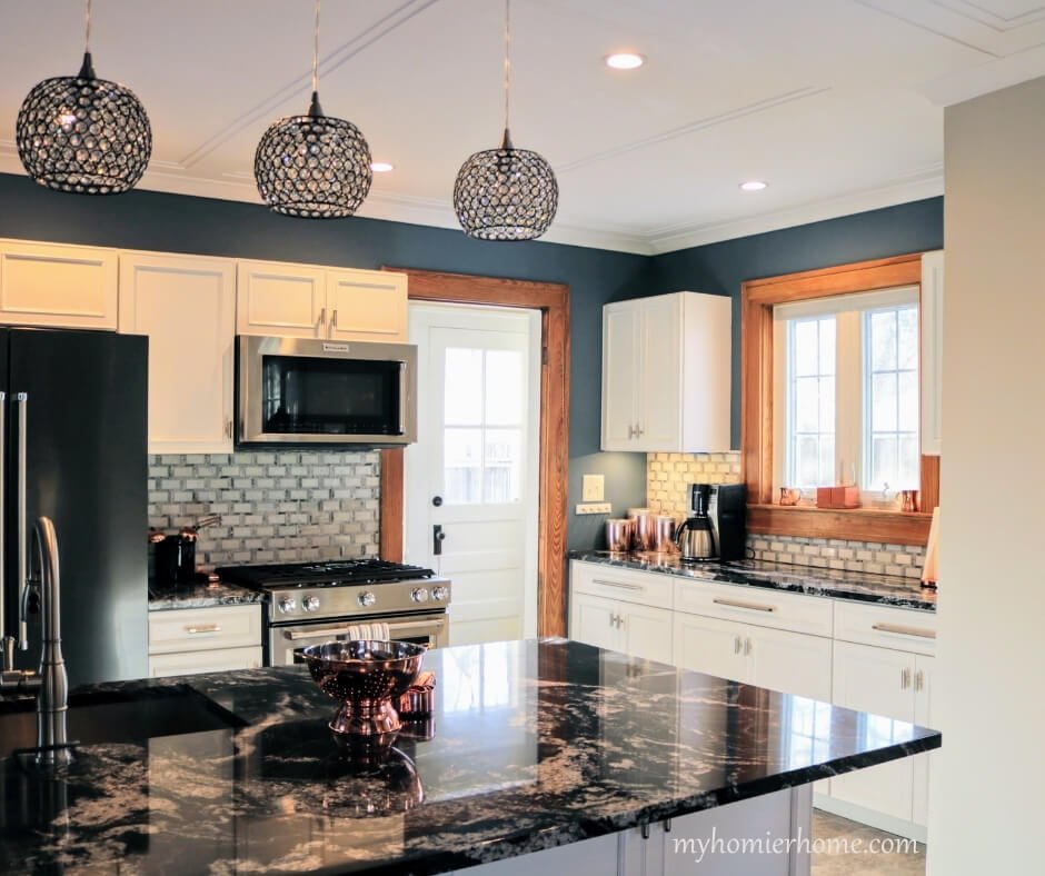
I have cherry wood cabinets in the kitchen that I toned down by choosing a neutral paint with more gray (BM revere pewter) and choosing a light gray backsplash.
These are not my ideal color of cabinets, but they are well crafted… and the hubs loves them, so they stay.
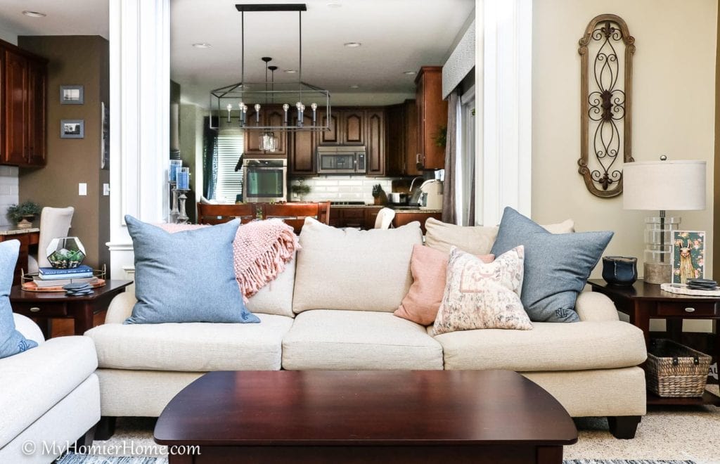
Warm colors have a range of emotions from comfortable and warming to hostile and angry.
Red, as we know, is the color of love, but it is also the color of anger.
Red can create an intensity and energy that you may not want in your room, but done in the right tone, it could create a warm and loving space, too.
A lighter tint of red, like pink, can be very calming and romantic.
Orange is a very happy and energizing color that can stimulate the mind.
Orange has been said to stimulate appetite, too.
Yellow is both a happy and frustration-inducing color that also stimulates appetite because of how much light it reflects into our eyes.
Neutrals
White, black, gray, and brown are all neutral colors that you don't necessarily find on the color wheel.
This is not to say you can't choose them as part of your main color scheme, but they, too, have an emotion-evoking presence.
We will talk more about choosing neutrals in part 2 of this color discussion.
White tends to evoke a feeling of cleanliness and innocence while black creates a feeling of power, strength, and authority.
Gray is a very common neutral these days because it is timeless and practical while brown is making subtle appearances in decor because of its natural aesthetic evoking feelings of reliability, comfort, and stability.
It can also create a sense of sadness, too, so you have to use it in small doses.
Further Reading
In case you are obsessed with this color psychology like me, I attached some of the articles I found that add to this discussion:
- Chart of Emotions for Every Room in the House
- To help you with identifying the feeling words you are looking for in each room
- More Detailed List of Descriptor Words for Each Colors Corresponding Feels
- Color by color words to describe what feelings they evoke
- How Color Affects Mood
- Color feelings as it pertains to interiors specifically
Your Action Items
This basic information on color theory and the psychology of color is important when you move on to actually choosing a whole home color scheme.
But before we move on though, I have some homework for you.
After reading this post, you are probably leaning one way or the other on a few things.
Answer the questions below before diving in to Part 2: Creating a Whole Home Color Scheme.
These questions will help you gather your thoughts and hone in on your own color preferences and style.
- What colors make you happy?
- What colors do you love to wear?
- What colors are you drawn to when looking at other people’s homes in person or in magazines?
- Which color combination palette do you feel most describes the feelings you want to evoke in your home? (i.e. monochromatic, complementary, analogous, split complementary)

